

More information on the ink test procedure here
Part 2 – Getting Down To Earth –
Chiku Rin, Ina Ho, Shin Ryoku, Syo Ro, Tsukushi, Yama Guri
Skipping ahead?
Part 4 – It’s Getting Dark – Fuyu Syogun, Kiri Same, Ku Jaku, Take Sumi, Tsuki Yo, Yu Yake
Pilot Iroshizuku is a range of premium inks that draw their inspiration from the natural beauty of the Japanese countryside. These Iroshizuku inks are possessed of sufficient visual depth and subtlety to be worthy of the flora and celestial features after which they are named. The Iroshizuku namesake breaks down to Iro (color) Shizuku (drops), which I would think translates to drops of color. I do believe many would agree that it is an apt and adequately poetic appellation for a range of liquid inks.
In this first of the four part feature covering Pilot’s 24 color Iroshizuku ink range, I will be introducing the inks in the range of blues. Each review entry will be covering the ink’s namesake, its properties and any particularly notable features of the inks in the usual ink test procedure.
On a personal note, I must say that the Iroshizuku inks come in truly elegant bottles. The current range of Pilot Iroshizuku inks come in two flavors: The mini Iroshizuku bottles with 15ml of ink per pop, and the primary bottles containing 50ml of glorious ink. While mini Iroshizuku inks may be obtained separately, it is also common to encounter them in gift boxes of 3 bottles. I think it is a brilliant idea on Pilot’s part to have the inks in 15ml capacities: Just large enough to not qualify as an ink sample, yet not voluminous enough to produce a guilt trip from hoarding ink that goes largely unused.
Coming back to the review proper, the inks tried so far are remarkably well behaved. They trend towards the dry end of the spectrum, yet remain well lubricated. Despite their luxurious coloration, the inks have proven to be comparatively easy to clean out of the pens I’ve used them in. This is quite a welcome surprise considering how difficult some inks can be. But enough talk, let’s move on to the reviews!

Pilot Iroshizuklu Ajisai translates to “Hydrangea“, which is a flowering shrub common to various parts of Asia. I used to have a Hydrangea plant growing at home, and it bloomed with a very distinctive inflorescence of bluish purple flowers arranged in an almost circular head. Of course, it must be noted that Hydrangeas do indeed come in quite a variety of colors, so one cannot expect the ink to match some generic Hydrangea flower color – because there is none.
That said, Iroshizuku Ajisai is a very sober blue with purplish aspirations. It is definitely dry even for a Pilot ink, yet it retains a very interesting sort of shading, if it may even be called that. The ink tends to develop a border of darkened blue, which lends a sort of contrast to the writing which makes it stand out quite nicely from the background of the paper.
The ink proves to be somewhat smudge resistant, though I definitely would not count on it for water resistance. That said, I think Iroshizuku Ajisai is sufficiently well behaved and blue enough to be used as an everyday ink on those drier pens in one’s stable. I expect the color would stand up to the scrutiny of reasonable formal use.
Shading – Minimal, edge darkening lends a beautiful highlighting
Bleedthrough – None
Feathering – None
Sheen – None
Smear Resistance – Limited
Drip Resistance – None
Flow – Dry

Sky blue is the roughly translated name of Pilot Iroshizuku Ama Iro. It must be a rather optimistic sky to be this particular variety of gentle cyan. Like Iroshizuku Ajisai, this ink is definitely dry, yet well lubricated. Remarkable, really, because I fully expect such dry inks to be a pain to use. Pilot has really made this ink series work well. In addition to this, Iroshizuku Ama Iron shares the edge darkening of Iroshizuku Ajisai, which does make the ink pop right fine.
This ink is less legible on smudging, and I definitely do not recommend that one let this ink come in contact with water. Predictably enough, it is also dismal on a soak, but a bad smudge usually does not forebode good water resistance anyway. Given its lightness I reckon Iroshizuku Ama Iro is less suited to formal use, but the beauty of that color and the subtleties it holds will likely yield it a loyal following regardless.
Shading – Moderate, lovely edge darkening to give it that pop.
Bleedthrough – None
Feathering – None
Sheen – Subtle metallic purple
Smear Resistance – Dismal
Drip Resistance – Nonexistent
Flow – Dry

Pilot Iroshizuku Asa Gao takes its name from the Morning Glory flower, which is a vine that has large trumpet shaped flowers. Again, there are many varieties of this plant, with flowers that are commonly seen to be anywhere between purple and bright blue. It will probably be impractical to pinpoint exactly which Morning Glory inspired this particular ink.
Iroshizuku Asa Gao turns out to be a rather deep blue with a hair towards the purple end that originates from its metallic purple sheen not unlike that seen in some rather oily ballpoint pen blues. However, unlike the humble ballpoint’s greasy offering, Iroshizuku Asa Gao has quite a remarkable edge darkening going on, which when combined with its gentle shading, combines to produce writing that simply demands a second look. It is a blue that may be dismissed at first glance, yet maintains a depth to its appearance that makes one want to get close and see it in all its inky blue glory.
Iroshizuku Asa Gao has some limited legibility after smudging, and is quite clearly illegible after a soaking. Despite its (lack of) waterproofing, I would still highly recommend that one consider this ink. It is a somber rather than vibrant blue, yet somehow manages to reveal subtleties that other blues in its tonal range fail to deliver. It is also great for use in a work setting…if one isn’t prone to spilling coffee on one’s work.
Shading – Subtle due to darkness of ink, lovely edge shading.
Bleedthrough – None
Feathering – None
Sheen – Metallic purple
Smear Resistance – Limited
Drip Resistance – None whatsoever
Flow – Dry

Cerulean Blue is the namesake of Pilot Iroshizuku Kon Peki. I am unsure as to the Japanese cultural connotations of the color, but I would interpret it as a reference to the azure hue of the open sea. Seeing as how Ama Iro has the sky covered, I reckon a maritime interpretation is called for here. And I must say that this ink does in fact remind me of the sun shining through clear blue waters.
Iroshizuku Kon Peki is a remarkably popular ink by all accounts, and I think it is easy to see why. As a dry medium blue leaning on turquoise, Iroshizuku Kon Peki is sufficiently well associated with blue to count towards being a staple ink at work, yet has enough fun in it to prevent it from being a boring Just-Another-Blue. Like the other Pilot Iroshizuku blue inks, Kon Peki shares the metallic purple sheen and tendency to develop a distinct dark edging to its lettering. Fetching, really.
Sadly, Iroshizuku Kon Peki is also very vulnerable to smudging and don’t for a moment think of wetting the writing. This utter lack of waterproofing is a black mark by my book, but much of the sin has been absolved by its gem-like beauty.
Shading – Slight, with the classic Iroshizuku blue dark edging.
Bleedthrough – None
Feathering – None
Sheen – Metallic purple
Smear Resistance – Nope. Don’t even try.
Drip Resistance – I said don’t even try, and I mean it.
Flow – Dry.

Pilot Iroshizuku Tsuyu Kusa is apparently the Asiatic Dayflower. This one I needed to look up, because it is the first I have heard of it (albeit understandably so considering my extremely limited knowledge of botany). I may or may not have seen it around my area, but I imagine as a flower it would be relatively unremarkable. It is not a plant that readily catches the eye.
On the other hand, Iroshizuku Tsuyu Kusa does seem to capture the essence of the Dayflower’s coloration rather well. It is a receding sort of almost pastel blue with a touch of purple to its lineage lending it some darkness. Flowing slightly wetter than the previous blues, Tsuyu Kusa still has that Iroshizuku darkness around its edges and the metallic purple sheen when laid on wetly.
Amongst the blues of Iroshizuku, however, I would rate this ink to be the most boring. By boring I mean predictable, and that may well be a virtue by the books of other people. Apart from its own natural highlighting, frankly I would have thought I’ve seen this ink before elsewhere, multiple times. Perhaps it does indeed take after its namesake.
It does have some resilience in being resistant to a casual swab, but it does not take well to soaking. Then again, none of the Iroshizukus are reputed to be waterproof or even water resistant, so none of this should shock anyone. Really, it shouldn’t.
Shading – Slight, with the standard edge darkening.
Bleedthrough – None
Feathering – None
Sheen – Metallic purple
Smear Resistance – Limited.
Drip Resistance – Most definitely none.
Flow – Normal-dry.

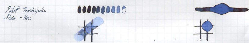
Wow. Just wow. Pilot Iroshizuku Shin Kai seems to mean Deep Sea, and I do think it means it. I typically have a weak spot for midnight blues, and I have seen a good bit of the night sky considering I am not a fan of the sun to begin with. This particular midnight blue, however, has me in awe.
Iroshizuku Shin Kai starts off as a fairly unremarkable dusky blue, almost a blue black that is so subtle it almost looks like a grey. Yet, there is something else to it that catches the eye. Yes, it has the darkness to the edges that I have repeated like a broken record, but it goes beyond that: Iroshizuku Shin Kai has a very pronounced dark metallic red-purple sheen! Once dry, this ink looks run of the mill at a glance, but that glint of red-purple along the edges of the writing gives one pause. This, I will say, is a most remarkable ink, with depths that invite the eye to come in, have a spot of tea and stay for the night.
This particular ink is actually rather resistant to a smudge, as one might expect of most blue-blacks. In fact it somewhat underperforms what I am used to seeing in a blue-black. It is also quite illegible on a soak, so please do not waste this beautiful lettering with a soak. However, on the whole, I really do not have the words to describe this ink. I would think it is sufficiently serious toned to warrant work use, yet it just defies classification and will definitely benefit any writing that is designed to jump out at the reader and hold them close until the coming of the dawn.
Shading – Moderate for a midnight blue, with amazing edges to the letters
Bleedthrough – None
Feathering – None
Sheen – Pronounced dark metallic red-purple
Smear Resistance – Moderate (YAY!)
Drip Resistance – Limited
Flow – Dry
Well, that concludes this particular edition of the Pilot Iroshizuku inks feature. There will be more to come, so stay tuned. In the meantime, feel free to explore the rest of the Ink Test Library. Click on the link down below:
[Ink test Library] Click here for all previous ink tests
Continue here:
Part 2 – Getting Down To Earth –
Chiku Rin, Ina Ho, Shin Ryoku, Syo Ro, Tsukushi, Yama Guri
Skipping ahead?
Part 4 – It’s Getting Dark – Fuyu Syogun, Kiri Same, Ku Jaku, Take Sumi, Tsuki Yo, Yu Yake

oh my, your ink tests are amazingly detailed – and I adore your writing style. Thank you so much! I’ll certainly go hop on to the others now.
LikeLiked by 1 person